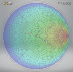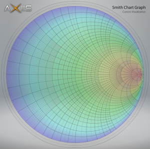
Progress is being made on the Smith Chart enhancement for WCAP. It’s to the point of plotting in-impedances (blue) and out-impedances (red) for a transmission line. Some work still needs to be done on the data input model as well as the hover-over data tips so that you can see the actual values when you mouse-over a point.

Awhile back, we got a new feature request from ClearChannel for WCAP. They are currently having to copy/paste the transmission line analysis data from WCAP into another program in order to display it on a Smith Chart. I’ve been working with the Axiis data visualization open-source project to create a Smith Chart for them. Once completed, this functionality will be added to WCAP so that you’ll be able to visualize the transmission line data.

